


If you spend serious time in a studio, you already know the real priority.
The room has to work.
You have to reach what you need, stay focused, and keep momentum when an idea shows up. The visual side still matters, though, especially now that so many producers are filming clips, running livestreams, doing Zoom sessions, or posting quick updates during a release cycle. The studio ends up on camera even when you did not plan for it.
The trap is treating studio aesthetics like decoration, because that mindset can pull you into decisions that slow you down. You add objects you now have to move around. You buy lighting that creates glare on screens. You stack gear in a way that looks good in photos but makes routing annoying.
The best version of a studio look follows one rule: it cannot break the workflow. That applies to how you store cables, how you place instruments, how you manage desk space, and how you control what shows up in the frame behind you.
This guide breaks down three looks that producers tend to gravitate toward and shows how to execute each one in a way that stays functional.
Minimal focuses on fewer objects and a cleaner frame.
Moody focuses on controlled lighting and fewer distracting surfaces.
Maximal focuses on curated zones that look full while staying organized. None of these requires a redesign. They are about editing decisions, repeatable systems, and making the room easier to work in.
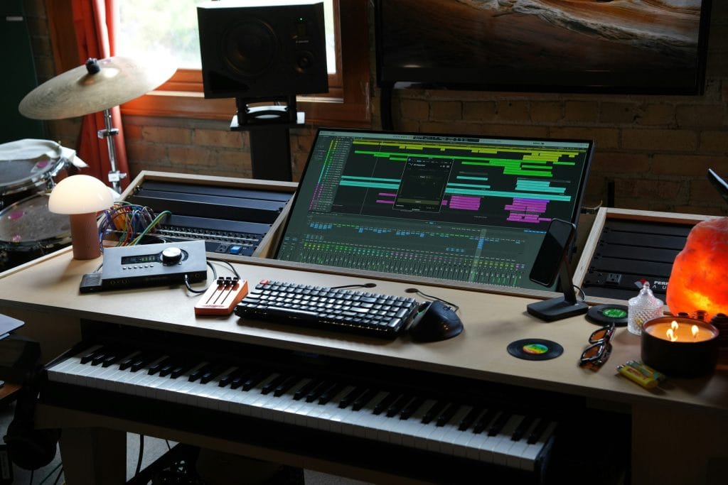
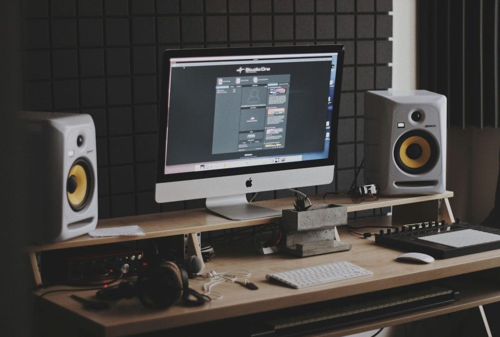
Minimal – fewer objects, clearer framing, fewer distractions
Minimal works best when you treat it like a maintenance plan, not a makeover. The main goal is to reduce visual noise in the places your eyes go most often: the desk, the screen area, and the background that sits behind your head and shoulders on camera. When those zones are clean, you feel calmer working, and your footage looks more intentional without trying.
Start with the desk surface. I keep only the items that are used daily within reach: keyboard, mouse, interface controls, one notebook, and a small container for the one or two tools that always get used. Everything else gets a home that stays off the desk. If an object does not have a home, it becomes desk clutter by default. That includes adapters, spare cables, guitar picks, SD cards, batteries, and handheld recorders. Minimal does not mean owning less gear. It means having fewer loose objects competing for space.
Then look at your “camera background zone,” which is usually the wall behind your desk or the angle behind your chair. Minimal looks best when the background has one clear line of visual structure. That might be a single shelf, a single piece of framed art, or one instrument on a stand. The mistake is adding three or four separate points of interest because the background starts looking like a storage area again.
The easiest way to keep minimal functional is to build two storage layers. The first layer is “fast access,” meaning the drawer, cart, or shelf that holds the stuff you touch every session. The second layer is “less frequent,” meaning bins, cabinets, or closet storage for items that you use weekly or monthly. Minimal studios stay minimal because fast-access storage exists. If fast-access storage is missing, the desk becomes that storage.
On the filming side, minimal gives you the cleanest results with the least effort. It reduces the risk of distracting objects behind you, and it makes your clips look consistent across weeks. If you rotate one element, like a book stack or a small plant, it reads like a deliberate choice. If you rotate five elements, it reads like you are reorganizing every day.
I also keep the minimal look compatible with “real use” by leaving one controlled mess zone. That might be a tray on the side of the desk where current-session notes live, or one shelf where works-in-progress can sit until the track is done. The point is to avoid spreading the mess across every surface. One zone can be messy. The rest stays clear.
Moody – controlled lighting, darker corners, fewer reflective surfaces
Moody studios can look great on camera and feel good to work in, but they require more discipline than minimal effort. The main issue is light control. Once you run lower lighting, every stray reflection and inconsistent light source becomes noticeable, especially on video.
The foundation is a simple lighting plan with fewer sources. I like one key light that hits the face area for filming, one practical light that makes the room feel lived-in, and then whatever the screens provide. You can get there with a small lamp and one controlled light source placed off to the side. The goal is consistency. If the lighting changes every time you film, your clips stop matching across a week of posts.
The second part of Moody is reducing reflective surfaces in the frame.
Glass, glossy plastic, polished metal, and bright white walls can bounce light back into the camera, causing weird exposure changes. You do not need to eliminate those materials, but you do want to be intentional about placement. Keep reflective objects out of the primary frame area, or keep them grouped in a controlled zone where you can manage how they catch light.
Moody also benefits from “dark corners,” but that only works when the corners stay clean. A dark corner filled with cables, random boxes, and loose stands looks like neglect on camera. A dark corner with one shelf and consistent objects looks controlled. This is where producers can win by treating the room like a set while still keeping it practical. Put storage in closed bins. Route cables along edges. Keep a single stand or one plant rather than a pile of unrelated items.
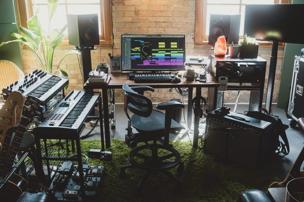
Maximal – curated zones that look full while staying organized
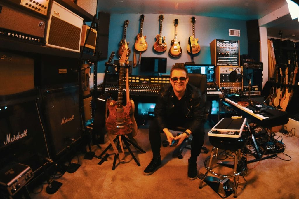
Maximal studios are common in music production because producers collect tools, instruments, controllers, books, records, and objects tied to their taste. The room can look full and still look clean if you build structure. Without structure, it looks like storage. With structure, it looks curated.
The First Rule
The first rule of functional maximal is zoning.
You cannot treat every surface as display space. Pick two or three zones that carry the look, and make everything else quiet.
The zones might be a shelving unit behind your desk, the side wall with instruments, and one corner where a floor lamp and a chair sit. When those zones look intentional, the rest of the room can remain practical without looking unfinished.
The Second Rule
The second rule is repetition. Maximal looks chaotic when every object is a different shape, material, and height. It looks controlled when you repeat a few object types and vary them slightly. This is where producers can use the same thinking they use in arrangement. Repeated elements create coherence. Random single items create clutter.
A simple example is using matching containers for cables and accessories. Another example is using the same frame style for wall art. Another example is repeating a single object type across a shelf so the shelf reads as a system rather than a pile. This is also where the sponsor placement fits cleanly.
If you want repeated glass objects to structure a shelf or a background corner, sourcing glass vases in bulk makes sense, as it gives you matching shapes you can place across zones without hunting for one-offs that almost match. That repetition keeps a full shelf from looking messy, and it makes camera angles feel related even if you film from different spots in the room.
The Third Rule
The third rule is depth control.
Maximal works on camera when the foreground stays usable, and the background carries the texture. If your desk is full of objects stacked at random heights, the shot looks busy and your working area becomes smaller. If your desk stays clear and the shelves behind you carry the full look, you get the visual benefit without sacrificing workflow.
I also treat maximal as “display plus storage,” not display alone. Shelves should include closed storage elements, like boxes, bins, or drawers, because producers have small items that do not look good on camera but need to stay accessible. When everything is visible, every session creates new visual mess. Closed storage lets you quickly reset the room.
Micro Piles
Another thing that helps maximal stay functional is limiting “micro piles.”
Micro piles are small stacks that form on every surface: mail, batteries, cables, adapters, spare strings, receipts, random tools. Each pile seems harmless, but ten micro piles make the room look unmanaged. The fix is giving those items one shared intake spot, like a tray or bin, and then processing it once a week. If you do that, the maximal look stays stable even when work gets busy.
For filming, maximal can look strong if you manage lines and negative space. You still want a clear area around your head and shoulders, even if the shelf behind you is full. Leave a small gap around the main outline of your body in the frame so the camera reads you clearly. That can be as simple as moving your chair forward a foot or moving one tall object to the side so it does not visually collide with your head.
Maximal also benefits from a “swap system.” If you have a single shelf zone, rotate one row each month instead of rearranging everything weekly. That keeps the room feeling fresh without turning your studio into a constant reorganization project. It also keeps your content consistent across a release cycle. Consistency matters because people recognize your framing and your background as part of your identity.
The “do not break workflow” rule – how I keep looks from slowing me down
In the studio, looks don’t matter if they add friction to writing, recording, or finishing. The way I keep aesthetics from interfering is by setting a few hard boundaries.
first boundary
The first boundary is that the desk stays usable.
That means the core tools never move. If you have to clear your desk before you can work, you will eventually stop clearing it. A functional desk setup is one where you can sit down and start within a minute. Any aesthetic change that breaks that rule is not worth it.
second boundary
The second boundary is that gear placement follows use frequency. Daily tools stay within reach. Weekly tools stay close but not central. Monthly tools go into storage. If you reverse that order just to make it look better, you will end up frustrated.
The room has to match your work habits.
third boundary
The third boundary is that every object needs a reset plan.
You should be able to reset the room in ten minutes. That means cable storage exists, a bin for loose items exists, and the shelves have a structure you can return to quickly. This is a producer’s version of keeping a session organized. If you lose that reset ability, the room becomes stressful, and the look falls apart anyway.
fourth boundary
The fourth boundary is that filming setups cannot require a rebuild each time. If you have to set up lights, move stands, clear surfaces, and manage reflections for twenty minutes every time you want to film a clip, you will post less. The best setup is the one you can turn on quickly. Keep one filming angle ready at all times, even if it is simple, then add a second angle only after the first one becomes routine.
Minimal, moody, and maximal can all work for producers, and none of them require a big budget.
Minimal is editing and storage. Moody is lighting control and surface discipline. Maximal is zoning and repetition. The real win is choosing the look that matches your working habits, then building a system that keeps the room stable even during heavy weeks. When the room stays stable, your workflow stays stable, and your content looks consistent without forcing you to think about it every day.
The post How To Make A Home Studio Look Good On Camera Without Redecorating appeared first on Magnetic Magazine.