

If you are planning a release, you are planning a media run, and that means your visuals start doing work the minute the announcement goes live and that’s what this article on photo shoots for artists is all about.
Press photos show up in places you do not control, including premieres, event listings, ticket pages, label announcements, playlists, and short-form clips that keep recirculating after release week. When yourimages look cohesive, you can adhere to Spotify’s image guidelines, editors and partners can place you quickly, and you stop losing time to last-minute scrambling.
When people say “get new press shots,” they often mean one photo that looks good on Instagram that’s properly sized and ratio’d. That mindset leads to a folder that fails as soon as a blog needs a horizontal header, a festival needs a square crop, or a playlist needs a circle profile image.
A consistent visual system solves that. It is a repeatable set of choices that keeps you looking like the same artist across a full promo cycle.
What A “Visual System” Looks Like In Real Life
A visual system is not complicated, but it does require intention.
It starts with a small set of decisions you can repeat across shoots, posts, and promo assets. You are choosing a lane so your photos, clips, and artwork do not look like they came from different projects.
At a practical level, it usually includes a primary photo set that does the heavy lifting, plus a smaller secondary set that still matches the same direction. It includes rules for cropping, since platforms aggressively crop images, and basic grooming standards, since small details become obvious in high-resolution photos and close-up video.
If you keep those choices consistent, you can pull content for weeks without changing your identity with every post. That is the goal. Consistency reduces friction for you and for everyone else involved in your rollout.
Set Your Baseline Before You Book A Photographer
Most artists book a photographer first, then they start making decisions in a rush. You will get a better result if you set your baseline first, then hire around it. This also helps when you are working with a label, a manager, or a publicist, because you can hand them a clear direction instead of a vague request.
Start by defining usage. Tell yourself, in plain language, where these images will go. Press kit, streaming profiles, label announcements, event flyers, social posts, paid ads, premiere pitches. That list determines the formats you need, and it changes how you shoot.
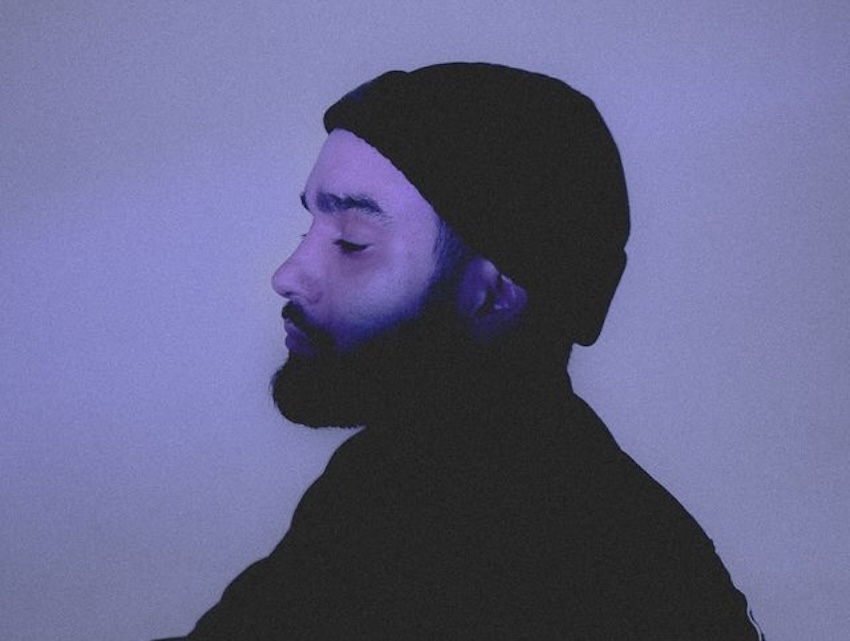
Next, pick a visual lane and stay in it. Choose one primary approach for the cycle. That could be clean studio portraits, daylight street shots, backstage realism, or a controlled lighting setup that matches your cover art. The key is that you choose one and commit. Mixing too many looks in one set makes it hard to use those images together.
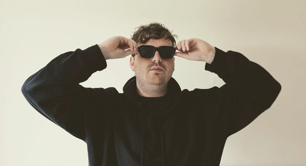
Then decide your repeatable look. This is not about turning yourself into a character. It is about reducing variables. Choose two outfits that feel like you, choose one hair direction you can replicate across weeks, choose one accessory approach you can keep consistent, and decide how polished you want the overall presentation to feel.
Once you have that baseline, building a reference folder becomes easy. Keep it tight. Ten images max. You are giving direction, not creating homework. The goal is to show the lighting, framing, posing, and editing style that you want to emulate.
Shoot For The Whole Cycle, Not One Announcement Post
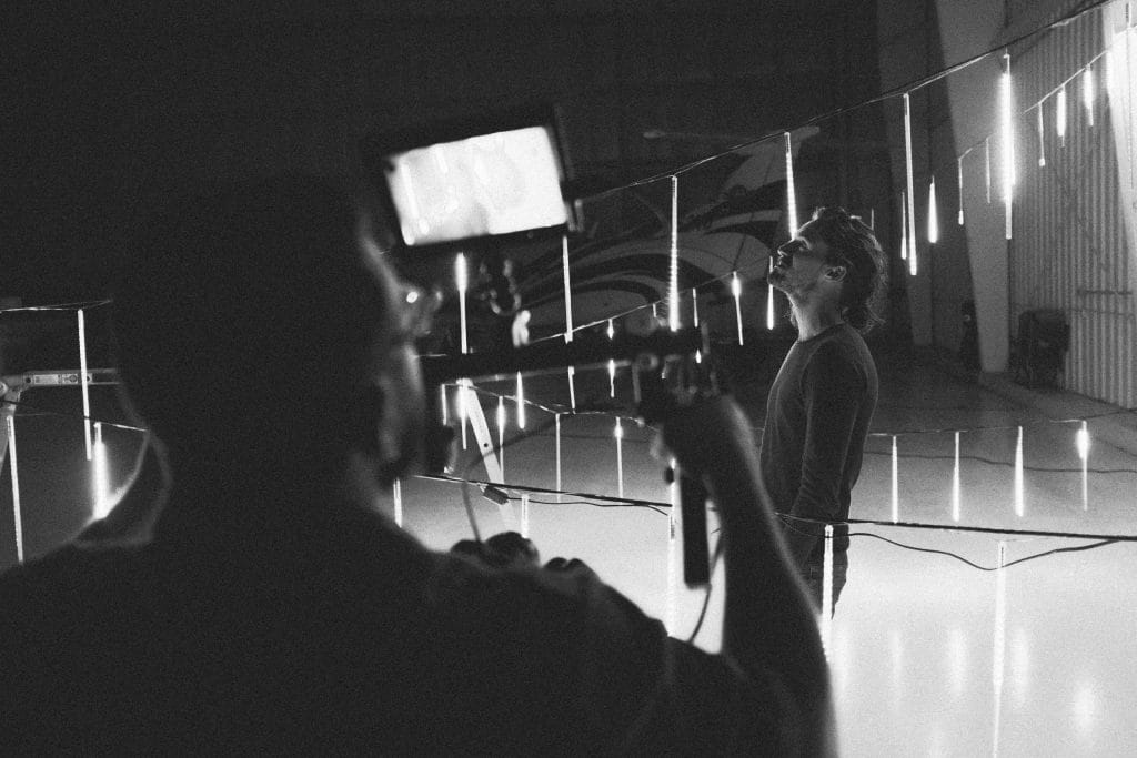
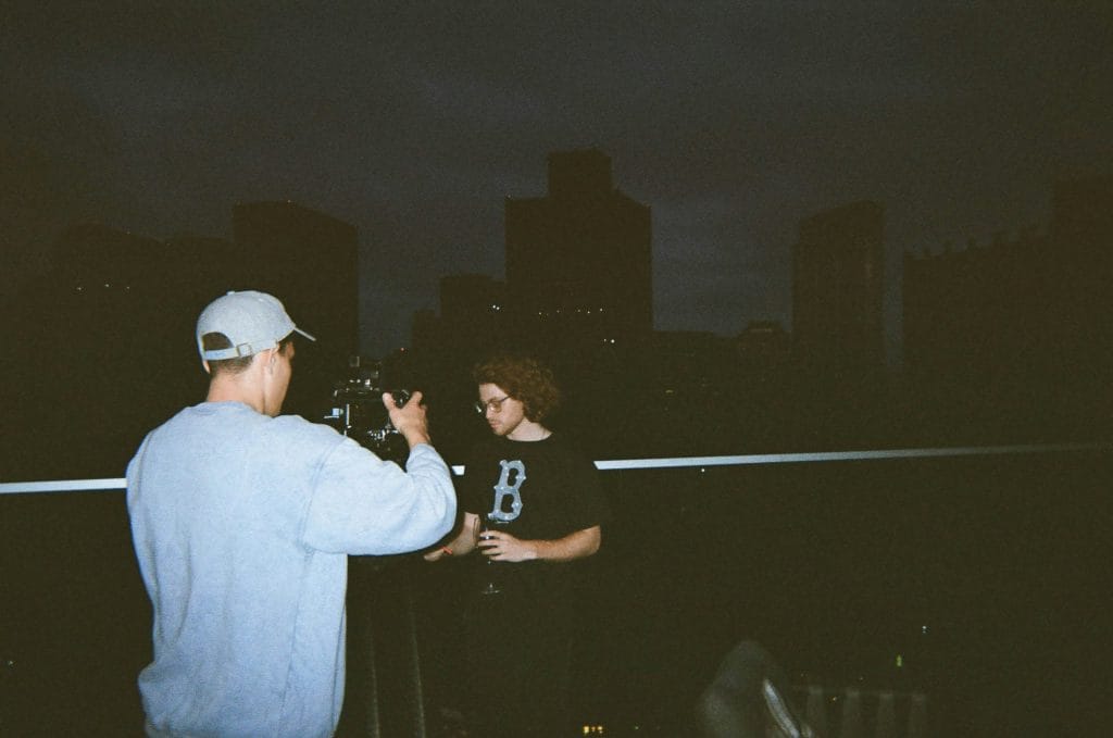
Treat a press shoot like a production day. You are not collecting one good photo. You are collecting a set that can carry your release, your media run, and your content plan.
That means you should think in formats first. You need images that crop cleanly into squares and circles, and you also need horizontal frames for header placements. You also need vertical options for reels and stories, because that is how a lot of promo gets consumed now. If your shoot only produces one orientation, you will end up stretching, cropping, or grabbing random phone shots later, and your visual consistency falls apart.
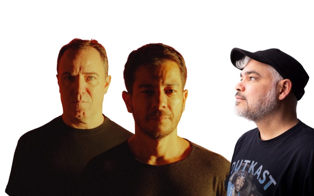
Location choices matter here too. Two locations is usually enough. One location can work if it gives you multiple looks without changing the overall direction. If you bounce around too much, the set starts to feel disconnected, and the lighting changes become obvious.
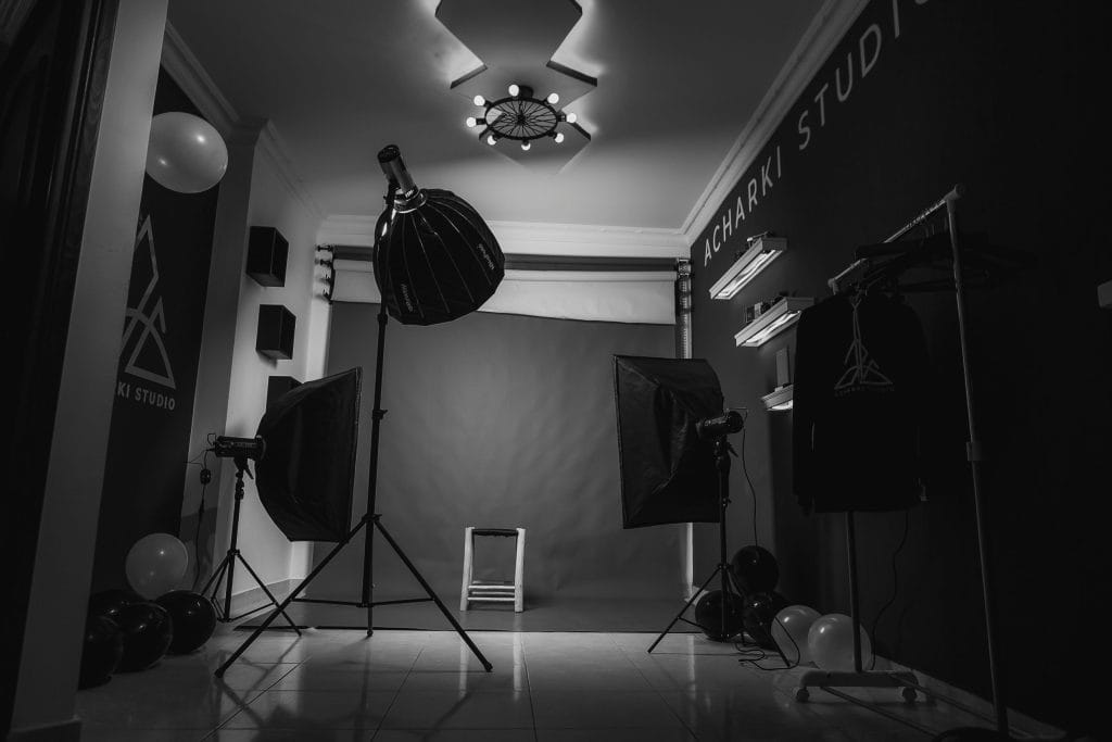
Lighting consistency is one of the fastest ways to make a set look professional. Pick one approach and keep it. If you are shooting natural light, keep the time window tight so the light stays similar. If you are shooting controlled lighting, keep the setup consistent across the session. When lighting shifts across a set, the photos stop feeling like a coherent package.
Editing consistency matters as much as lighting. Ask your photographer for a consistent edit across the full set, then choose your selects. If half the images are warm and half are cool, or if contrast levels swing from image to image, you will end up fixing it later, and later tends to mean never.
Here is the simple checklist I use for a “full cycle” deliverable set, because it forces the shoot to cover real-world usage:
- A mix of horizontal, square-friendly, and vertical images, so every platform has a clean option
- A small group of detail shots, so you have visual variety without breaking the core look
That is enough structure to keep the set usable across press, streaming, and social without turning the shoot into an overly rigid plan.
Grooming And Micro Details That Get Noticed On Camera
This is the part that artists underestimate, and then they regret it when the photos come back, and they cannot stop staring at one small detail. Cameras pick up things you do not notice in the mirror, and short-form video makes it even more obvious because hands and face are often close to the lens.
I treat grooming as part of the visual system, because it directly affects continuity across the cycle. If you shoot press photos with one grooming standard, then you show up in release-week clips with a different standard, it creates a subtle disconnect. People might not name it, but they will feel it.
You do not need an expensive routine. You need a repeatable standard you can maintain for a few weeks. I also recommend doing your grooming prep the day before the shoot, then doing a quick check the day of. If you are filming promo clips across the cycle, keep the same standard so your appearance stays consistent across posts.
Here is a checklist-style subsection you can use before a shoot day, before filming a batch of reels, or before a press interview that involves photos or video:
- Hair set to a repeatable style you can recreate for the next few weeks
- Skin managed for shine, since highlights show up fast under lights
- Facial hair edges cleaned up, because uneven lines show clearly in close shots
- Hands checked, because hands appear in DJ clips, studio clips, and phone video, and nails read on camera, so use something like foxnailsusa.com as a reference if you want current, maintainable options that still look clean in close-up shots
- Wardrobe steamed, because wrinkles look like carelessness in high-resolution images
- Accessories kept consistent, because changing rings, chains, and watches changes your visual identity in subtle ways
That list is not about vanity. It is about continuity and professionalism, and it saves time because you do not have to fix avoidable issues in editing.
A Simple Rollout Workflow That Keeps Your Visuals Consistent
Once you have the assets, your job becomes usage.
This is where many artists lose the plot. They post one polished image for the announcement, then they follow it with a random selfie, then they post a completely different look for release day, and the feed starts to feel disconnected. That disconnect hurts your promo because people stop recognizing your content at a glance.
A consistent visual system gives you a workflow that prevents that. I recommend building a small “asset pack” folder for the cycle. It should include your edited press photos, your crops prepared for square and vertical formats, and a handful of short clips from the same shoot day. Even simple movement clips work, because they share the same lighting and styling as your photos.
Then choose a hero image.
That is the one image that becomes your anchor across the cycle. Use it for your announcement, your press kit, your premiere pitch, and your key release posts. Repetition helps recognition. You can rotate supporting images, but the hero image keeps the cycle visually coherent.
From there, map a basic rotation so you do not make random choices during busy weeks. You do not need a complicated calendar. You need a sequence that keeps the story and the visuals aligned. Announcement uses the hero image. Teasers use clips and supporting images that match the same session. Premiere day uses a supporting image that still feels like the same set. Release day returns to the hero image or a close alternate. Week-after content uses vertical portraits and clips that still match the same direction.
QA Is Essential
Finally, do quality control before you pitch press.
Open the images on your phone and on a laptop. Check crops for square and circular formats, check for compression issues, and ensure your name and credits match across your press kit, filenames, and release metadata. That last part seems small, but it saves embarrassment and it makes editors trust you faster.
If you build a consistent visual system once, you can reuse it and refine it for each release. It becomes part of your process, and your promo stops feeling chaotic. Your music still has to deliver, but your visuals stop creating unnecessary obstacles. If you want, paste your release timeline and the platforms you care about most, and I will lay out a simple two-week promo plan that tells you what type of asset to use on each post, without turning it into a rigid schedule.
The post A Guide to Photo Shoots For Artists That Covers Press, Streaming Profiles, And Social appeared first on Magnetic Magazine.